
Choosing the right neutral paint can feel overwhelming—there are thousands of whites, grays, and greiges, and the wrong undertone can turn a cozy room cold or overly yellow.
Whether you’re prepping your home to list or just giving your space a seasonal refresh, these three tried-and-true neutrals are beloved by interior designers for making spaces feel larger, brighter, and effortlessly modern:
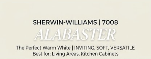
1. The Perfect Warm White: Alabaster (Sherwin-Williams 7008)
The Vibe: Soft, inviting, and never clinical.
- Why Designers Love It: Pure bright white can sometimes feel harsh or sterile under cool lighting. Alabaster offers just enough warm undertone to soften a room while keeping it bright and airy.
- Best Used For: Open-concept living rooms, kitchen cabinets, and main hallways.

2. The Ultimate Modern Greige: Revere Pewter (Benjamin Moore HC-172)
- The Vibe: Sophisticated, grounding, and versatile.
- Why Designers Love It: A perfect bridge between warm beige and cool gray. It adapts beautifully to changing light throughout the day and pairs seamlessly with both warm wood tones and cool metallic fixtures.
- Best Used For: Primary bedrooms, dining spaces, or creating a cozy, tailored home office.

3. The Moody Accent Classic: Hale Navy (Benjamin Moore HC-154)
- The Vibe: Rich, timeless, and dramatic without being dark.
- Why Designers Love It: True navy functions almost like a neutral in interior design. Hale Navy has blue and gray undertones that anchor a space without clashing with warm accents.
- Best Used For: Front doors, kitchen islands, vanity cabinets, or a bold accent wall.